DIY Farmhouse Kitchen Renovation Before and After
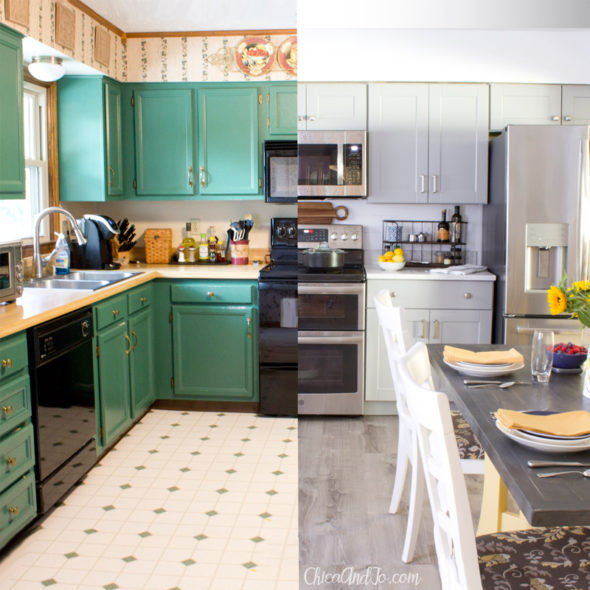
Jo's parents' kitchen was a thing of beauty back in the early 90s when they designed it, but it has become woefully out of place in this century. Jo has wanted to renovate the outdated kitchen for years, so when the opportunity came up this summer for us to work with The Home Depot to create a DIY farmhouse kitchen for them, we jumped at the chance.
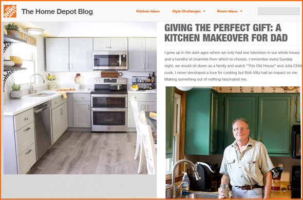
You can see the full reveal of our kitchen re-do on The Home Depot's blog, with more details about the awesome appliances we added to the kitchen, but here I'd like to show you some of the design elements that brought the room together.
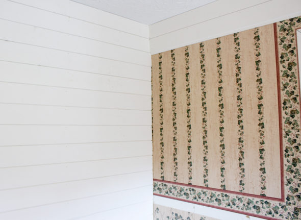
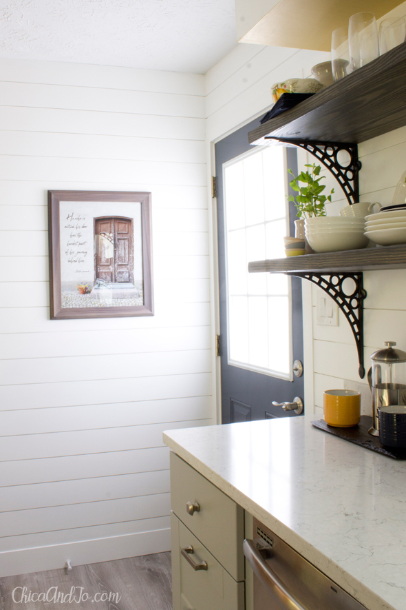
The first thing we did was cover all that wallpaper with ship lap. Besides being the wall finish Jo's mom had dreamed about, ship lap was a great choice for us because it meant we didn't have to strip the wallpaper off first. We could just nail it up right over top. Wow, what a difference this made!
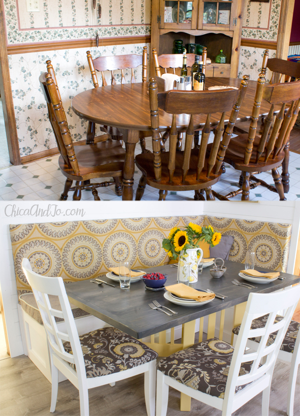
Then we tackled the biggest project in the room, which was the seating. They had a large oak table with ornate chairs that didn't work for them, either functionally or design-wise. We ended up building custom banquette seating and a farmhouse table for them, which brought so much more style and function into the room! It was a huge transformation, and you can read the details in our full post.
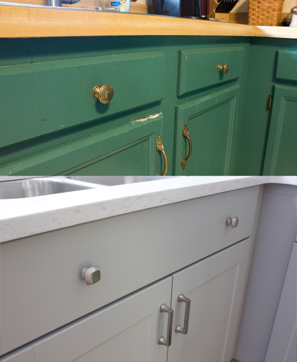
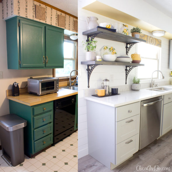
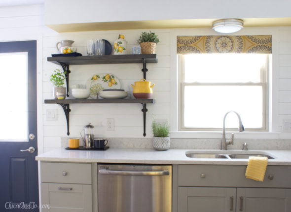
From here, the next biggest issue to address was the cabinetry. The old painted cabinets were really worn and a dated shade of emerald green. We replaced them with Hampton Bay cabinets, and topped them with a new Silestone quartz countertop. The difference was astounding.
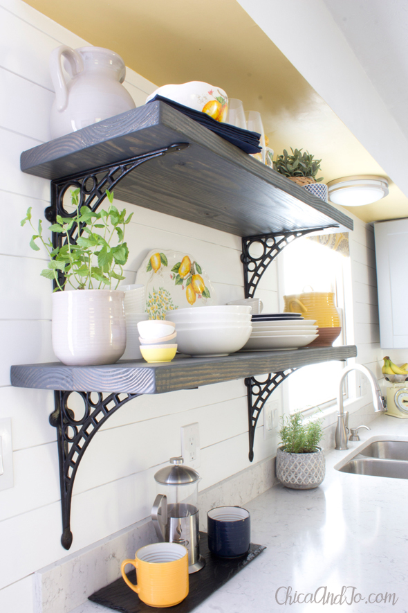
As soon as the old cabinets came down, Jo knew immediately that she didn't want to replace the one by the window. It was so obtrusive and blocked the light, so we decided to go with open shelving instead. This was the best decision we made in the kitchen, and her mom's favorite part of the renovation. To make the shelves, we just stained some boards to match the table, and mounted them on the wall with some gorgeous iron brackets from RCH Hardware.
To add another design element, Jo painted the underside of the soffit above the shelves in the same soft yellow DecoArt Satin Enamels paint that we used on the table base. We could not love it more!
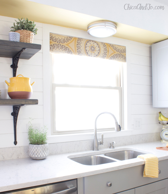
With a fresh coat of white paint and a tailored valance, the window over the sink is now more balanced and open, and provides so much more light to the room.
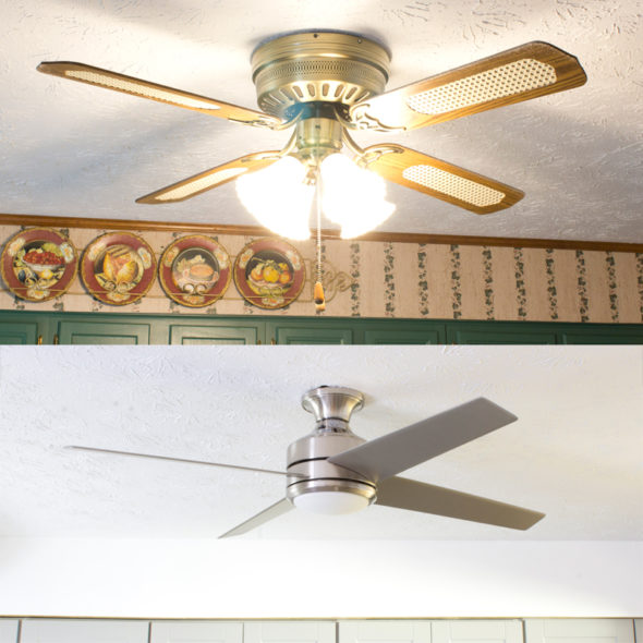
Along with a fresh coat of paint on the ceiling, we replaced the dated ceiling fan with a new, modern one. The new fan has a lower profile and offers more light as well.
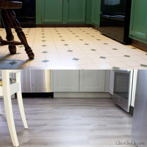
When all the construction and painting were done, we were finally able to work on the floor. We covered the linoleum floor with LifeProof luxury vinyl plank flooring for a waterproof floor that was really easy to install.
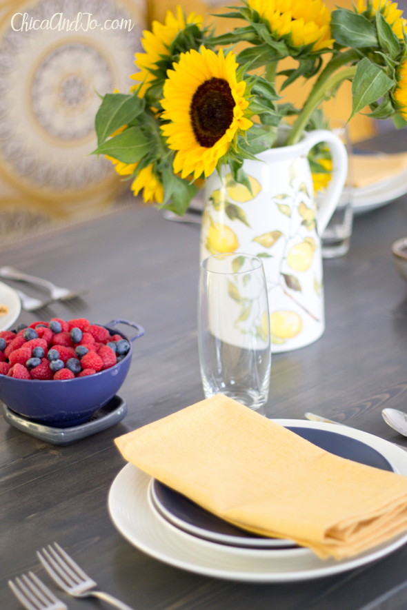
Decorating was the final touch, and Jo and her mother picked out new dishes in white and yellow, with pops of navy blue, a color we also chose to use on the back door.
Setting the table is a joy with new dishes and fresh flowers.
We left Jo's mom with one personal touch of art — a print of the European door photo I took on a trip to Helsinki.
Remember to visit our Home Depot blog post for the full reveal of our DIY farmhouse kitchen renovation!




2 comments so far:
Beautiful transformation, I especially love the cabinets and quartz countertop! I think I’ll head to a Home Depot to look at all their kitchen decor.
Thanks, Sherrill. We're thrilled with the result!