Complete Modern Spa Bathroom Makeover
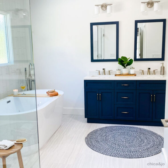
Ever since we bought our house 10 years ago, I have hated both the style and function of our main bathroom. There were so many things wrong with it that a makeover always seemed so daunting, so we kept putting it off.
But this year, I finally decided to do something about it. We came up with a completely new layout, a drastically different design, and clean, modern finishes that transformed the bathroom from dated and drab to spa-like and fab.
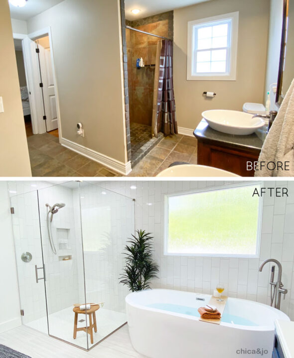
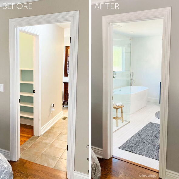
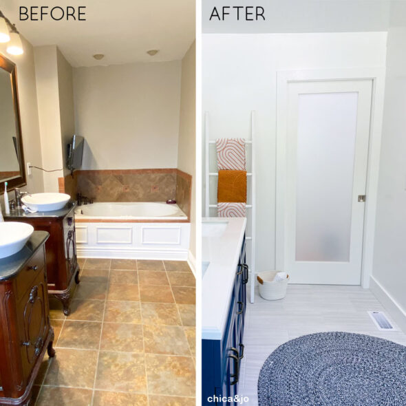
I will walk you through the main elements of my newly remodeled bathroom, including fixtures and design features, and share all the lessons and tips I learned along the way. Here's one before-and-after shot to show you just how drastic the transformation is... I'll share more at the end of this post. You'll be amazed as I am at the difference!
Upgrading to a freestanding jetted tub
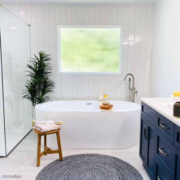
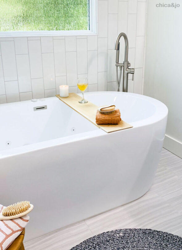
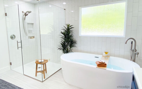
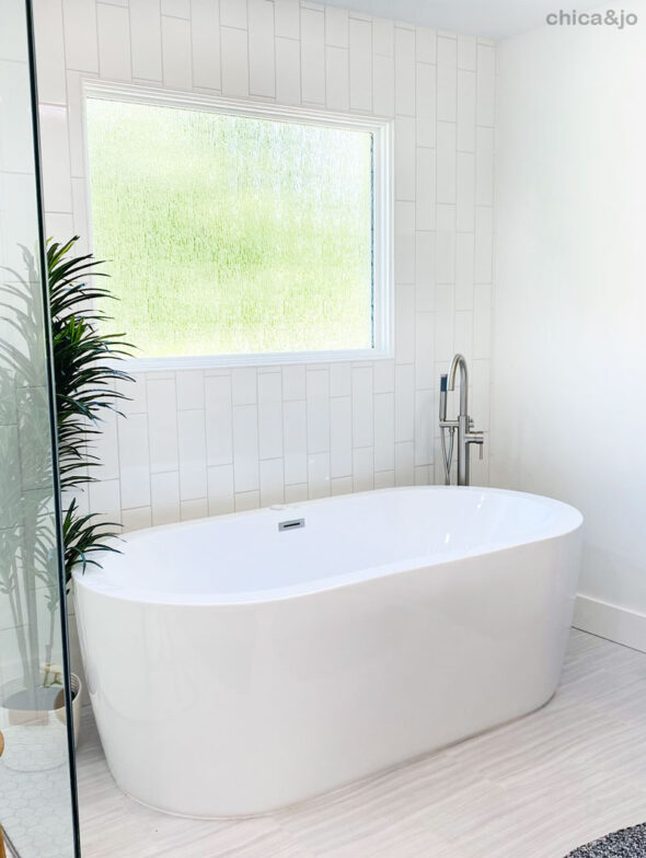
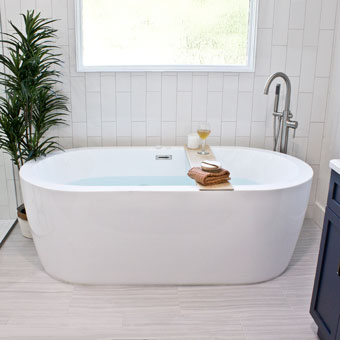
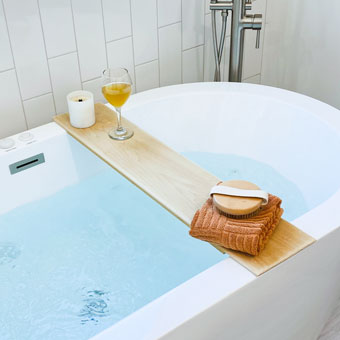
The first thing we knew we wanted in our new bathroom was a modern, freestanding jetted tub. Our old built-in tub was too small and had such a wide deck that it was hard to get in and out of and hard to clean. Replacing it was an easy decision.
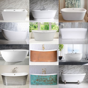
Figuring out exactly which tub to get was a bit more difficult. You can read all about my process for choosing a modern freestanding jetted tub, and I'm so glad I put in that effort because we love the size, function, and look of the new tub.
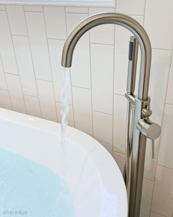
Since this huge tub would hold so much water, I made sure to purchase a faucet that could handle the task in a reasonable time. I chose the 12 GPM Woodbridge faucet that fills it up in no time.
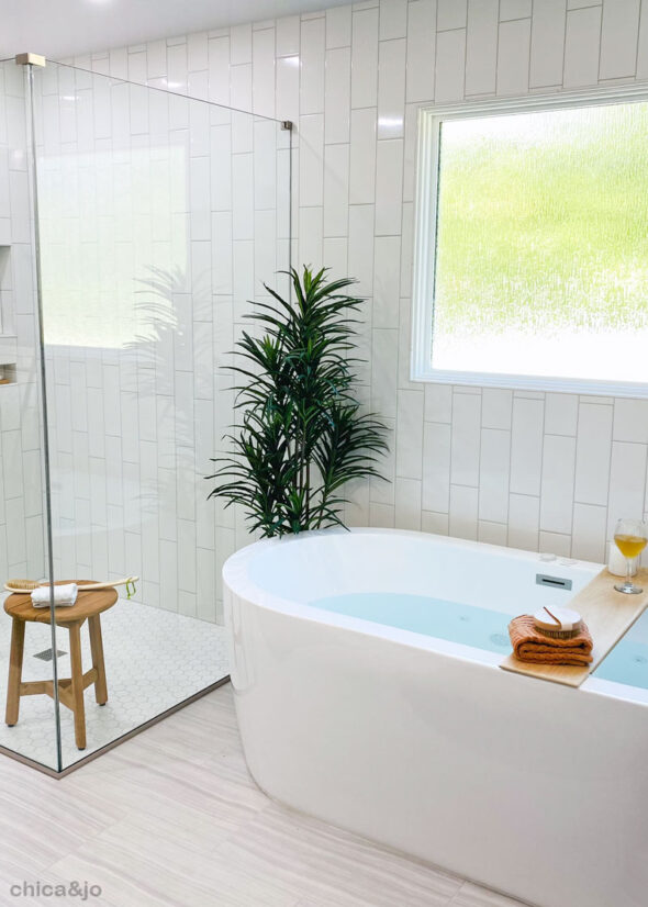
We decided to tile the entire wall behind the tub to make it easy to clean and waterproof, and continued that tile right down the wall to the shower, for a seamless look.
Adding a glass shower
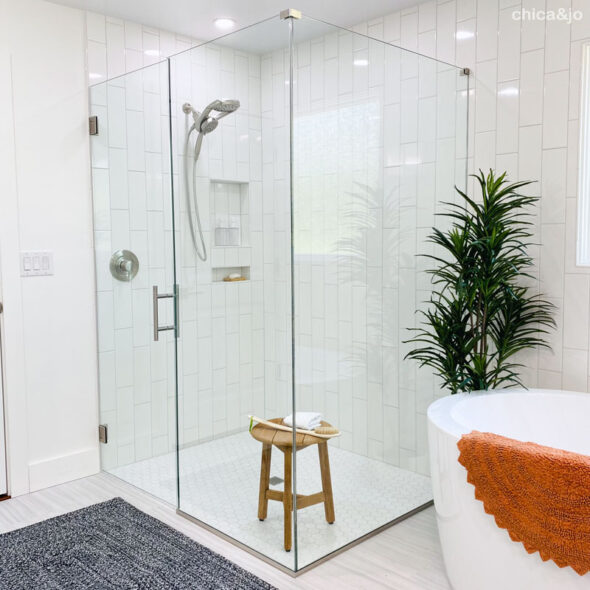
Oh, that gorgeous glass shower! We were originally planning to do a 3'x5' shower, but after seeing how much room we had after demo, we realized we could increase it to 4'x5', and I'm so glad we did. there's so much room in here and it's light and bright and gives the whole room an open feel.
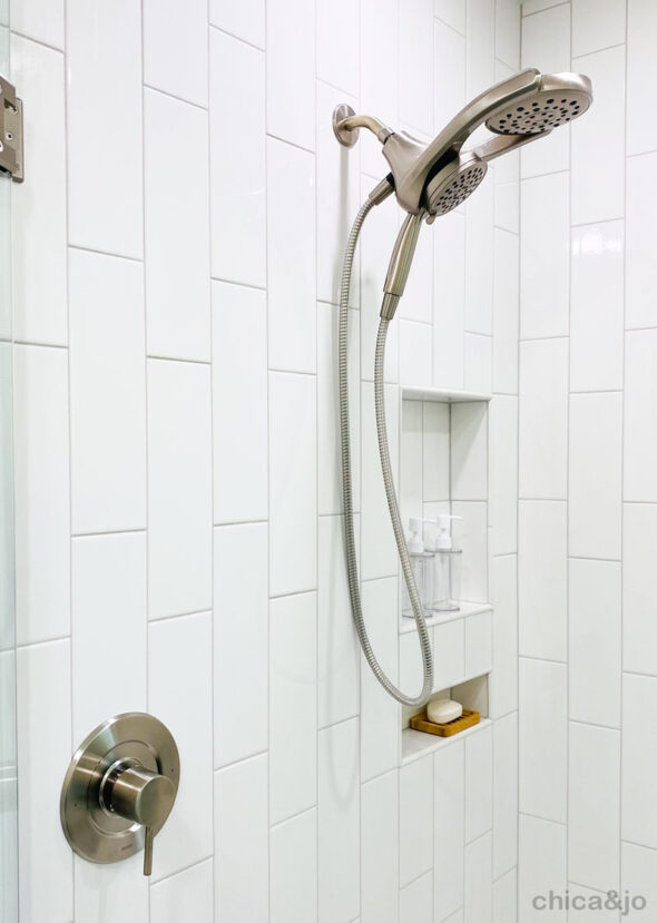
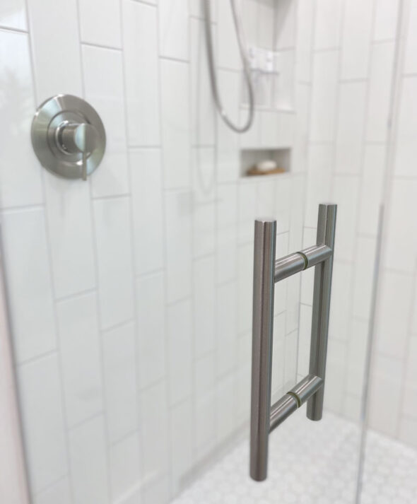
I spent a considerable amount of time researching shower heads and valves before finding one that would meet our needs. The Moen Align shower trim kit is so easy to use, and the Delta HydroRain 2-in-1 shower head offers incredibe massaging pulse and ultimate flexibility with the tiltable main head and handheld attachment. And take note — we put the handle off to the side instead of directly under the shower head, so that we could turn it on without getting wet. Such a simple tip but it's so useful every day!
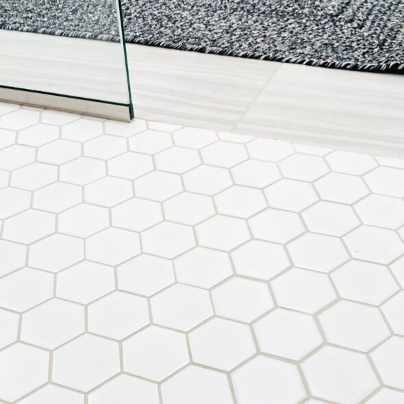
We decided to go with a curbless entry for the floor of the shower, and I'm so glad we did. it looks so much cleaner and sleeker without that curb, and it will come in handy for any future accessibility needs we may have.
The shower has a door that swings both in and out, which is very functional for us. And we splurged and got the C10 glass coating, which will protect it from stains, mildew, and bacteria. It has made such a huge difference and minimized cleaning time.
Choosing tile that won't go out of style
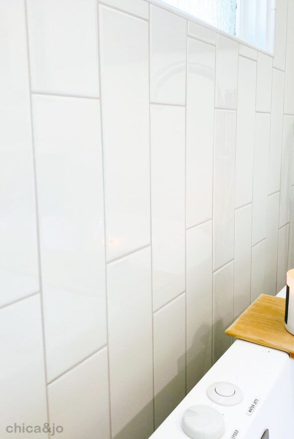
Since the tile was such a huge expense for this remodel, mostly due to the labor involved, I wanted to choose tile that wouldn't go out of style, or would at least last as long as it could. For the shower and tub wall, I chose a simple, white 4"x12" subway tile, and placed them vertically with a 1/3 offset.
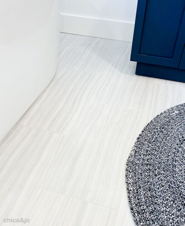
For the floor, I wanted to keep it simple but also wanted some design to add texture to the room. I chose a large 12"x24" tile with a simple gray swirl/stripe pattern that gives just enough design to make the floor feel more inviting.
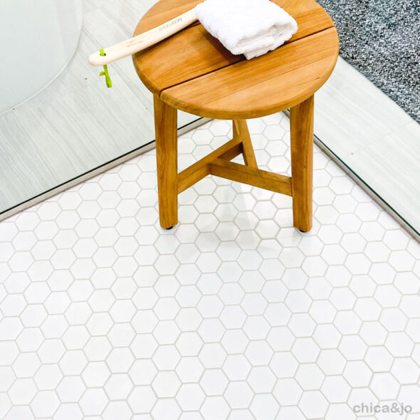
And for the shower floor, we went with a basic white hexagonal tile. All the tile in the bathroom has the same light gray grout, to tie it all together.
The best part about this design is that it will match almost anything. In the future, I could paint the walls or the vanity any color I like, and the tile will still look great. For me, that's the ultimate in flexibility for the future, because I don't plan on ever going through a remodel this grand again!
Finding a vanity with storage
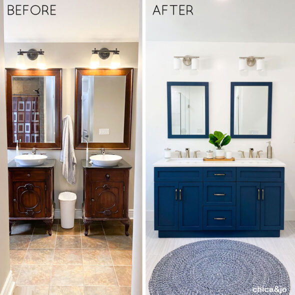
To the right of the tub, we placed our new vanity. The bathroom originally had two small, separate vanities, which offered us almost no counter space or storage. We replaced them with a large double-sink vanity and never looked back.
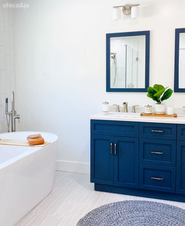
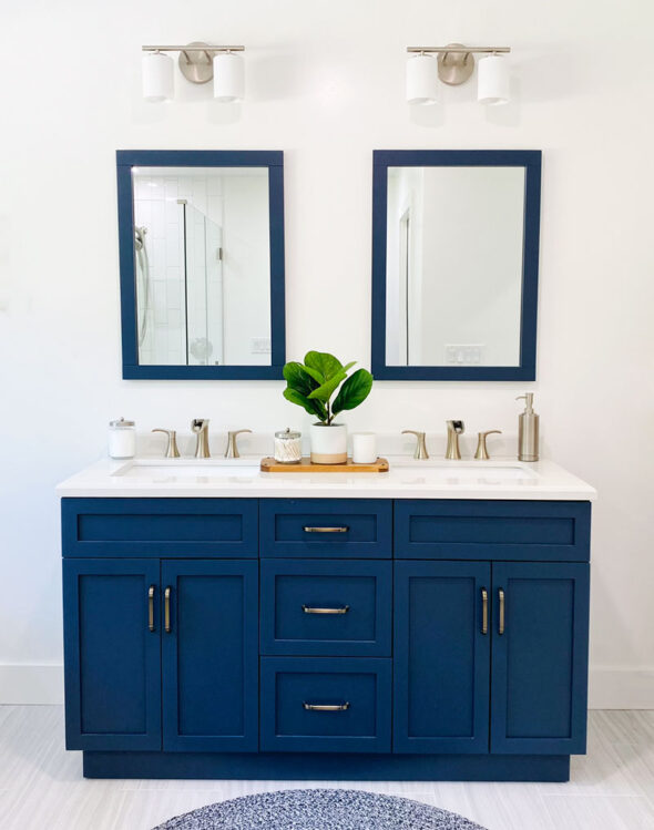
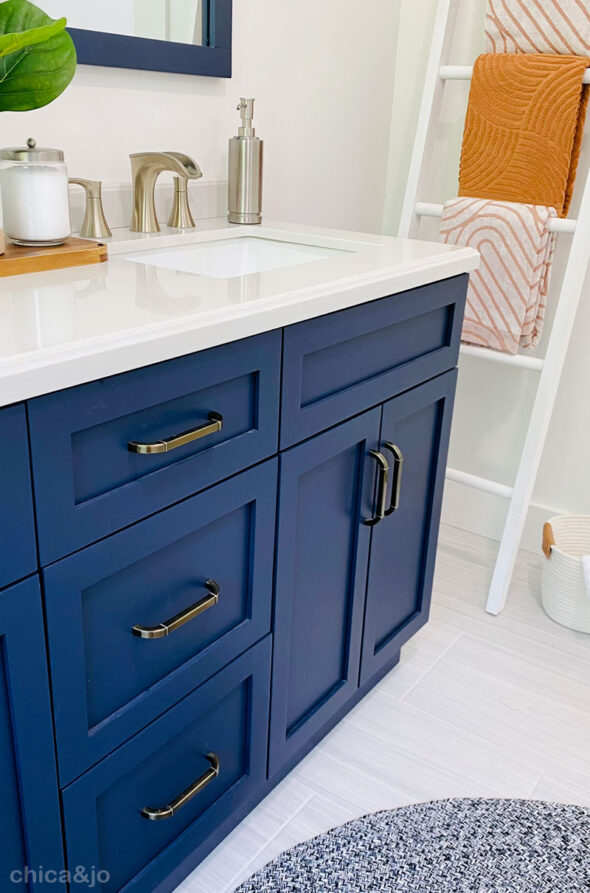
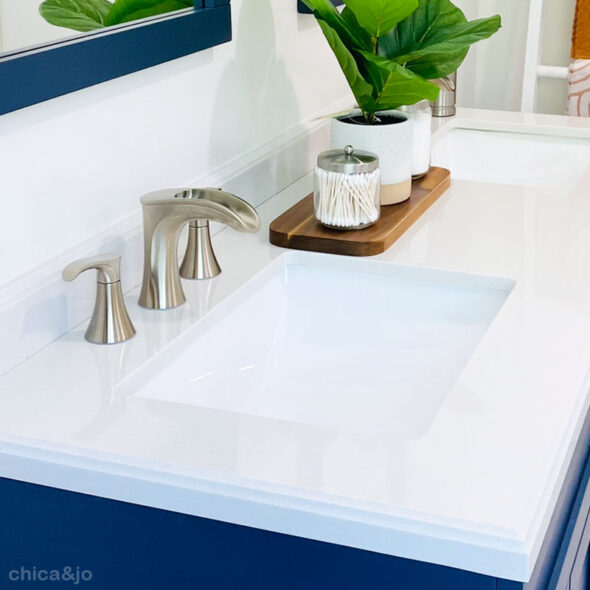
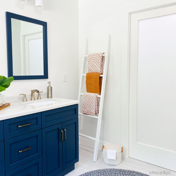
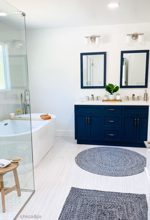
We chose the double-sink Lincoln 60" vanity with marble top from Home Depot, and that gorgeous navy color brings the huge pop of color the room has been waiting for.
The new vanity meets all our needs that the old one didn't. It has drawers and cabinets, offering a ton of hidden storage for us that we never had before.
And that full 60" counter gives me and my husband the extra space we wanted... we even have room for a plant on the counter!
Next to the vanity, I placed a towel ladder with some gorgeous towels from World Market, bringing a bit of color to this corner of the room. And next to that is a pocket door... hmm, what could that be for?
Hiding the toilet in a water closet
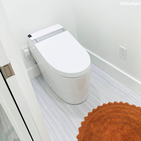
In the old bathroom layout, the toilet was conspicuously located in the corner of the room, offering zero privacy for the two people sharing this bathroom. I knew I wanted the ability to close it off from the rest of the room, so we tucked a water closet (a.k.a. toilet room) in the corner.
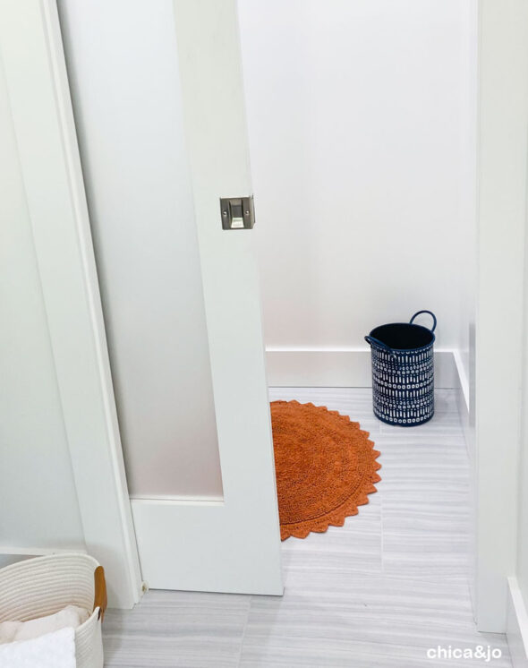
We used a pocket door on this toilet room to save space, and chose a frosted glass insert to allow light in while still maintaining privacy.
Behind the door is our new Woodbridge Athena toilet with every bell and whistle you can imagine. Heated seats, bidet, auto open/close, auto flush, nightlight, deodorizer... Why not splurge on something we use every day? It's amazing!
Enlarging the window for more natural light
One of the simplest changes we made that had the biggest impact was to enlarge the single window in the bathroom. We replaced the old small window with one over twice its size, with a textured rain glass finish that provides plenty of privacy with no need for shades.
The huge, new window lets an insane amount of natural sunlight every morning in this north-east facing room. I love it so much!
Changing the layout for added function
The layout of our original bathroom was a T shape, and it just wasn't functional at all. The two of us were always bumping into each other, and everything was dark and drab and dreary. I thought long and hard about how to make the space work for us.
The key to getting to make all the changes we wanted in this bathroom was a willingness to change the floor plan. We moved almost everything! The tub moved, the shower moved, the toilet moved, and most of the lighting and electrical moved. We even knocked down a couple walls and put up one new one.
We had to get creative to come up with the extra space needed for these new features — that tub and shower are huge — and the solution came when we decided to get rid of one of the two closets. We aren't clothes hoarders, so combining into one larger closet and getting rid of the smaller one to get the extra space made perfect sense for us.
The lesson here is to think creatively about rearranging things, and don't get locked into what your current floorplan is. You'll see in my before-and-after photos just how much more sense the new layout makes and how much mor functional it truly is.
Before and After photos
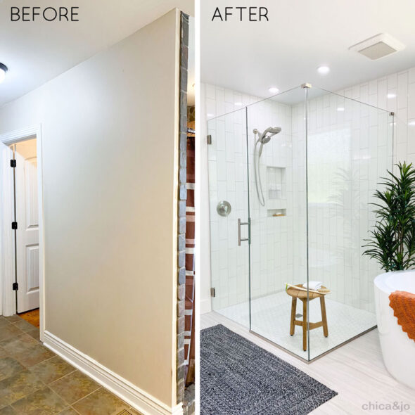
At last, I'll share the before-and-afters so you can see just how drastic this bathroom remodel was. Let's start with the doorway leading into the bathroom. It went from a long hallway and a small closet to a full and open space with everything in sight.
And when you walk straight ahead, where there used to be two small, brown vanities, there's now a large blue one with plenty of storage and bright new lights overhead.
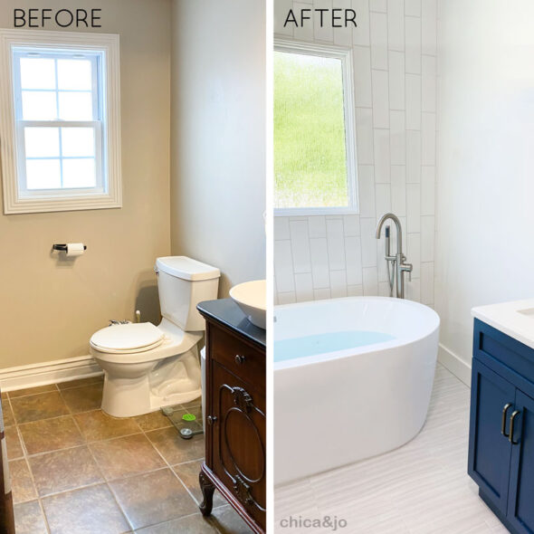
Turn to the left and you'll no longer see the toilet that used to sit there, but instead the faucet for that gorgeous new tub.
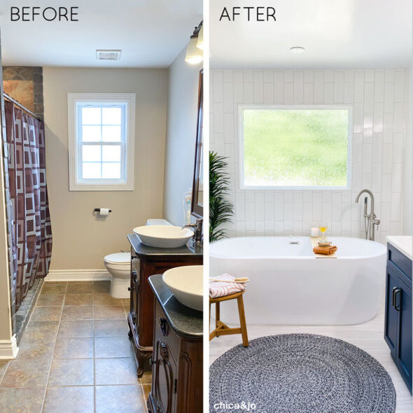
The tub looks so perfect in its new spot on this wall, and that big new picture window centered over it is so dreamy! And see that shower curtain on the left? That's where the shower USED to be...
... but NOW it has taken over the entire space previously occupied by that closet. Opening up this space allowed for the huge tub and beautiful glass shower. I can hardly believe the difference.
Here's a shot of the entire wall, showing that old shower a bit better. I promise, this really is the same space.
Finally, over to the right of the vanity, you'll see where the tub used to be, tucked in a corner where noone could see it. That space serves much better as the private toilet room.
I hope you enjoyed walking through this bathroom remodel with me, and I hope you found some good tips and inspiration. We'd love to hear any other bathroom remodel tips you have, so please share!




5 comments so far:
Absolutely beautiful! U ladies Rock!
That is an AMAZING remodel. I found the right blue I've been searching for in that vanity. Did you paint it? I hope you know the color. ?
I clicked on the vanity link, but it said it had been moved. Thanks for the help.
Jim, thanks so much! The vanity came already blue, so I didn't have to paint it. I'm going to try to match it to a paint color eventually, though, for some other decor. When I get the color name, I'll let you know!
Jim, I checked out the paint swatches at the hardware store and settled on Valspar's "Royal Navy" (4011-4) as the closest match to the blue of my vanity. Hope that helps you!
I love everything about this bathroom. Could you please tell me where you got the rugs?